
A clock is not an explanation
A countdown can make a scene urgent without helping anyone understand it. When the remaining seconds reach zero, the player may know that an opportunity was lost but have no idea why the opportunity existed. The correction-window study begins elsewhere: with the planned manoeuvre, the preparation it needs and the point after which that preparation can no longer finish in time. The aim is to show a changing relationship rather than add a timer to an otherwise static picture.
Put preparation on the route
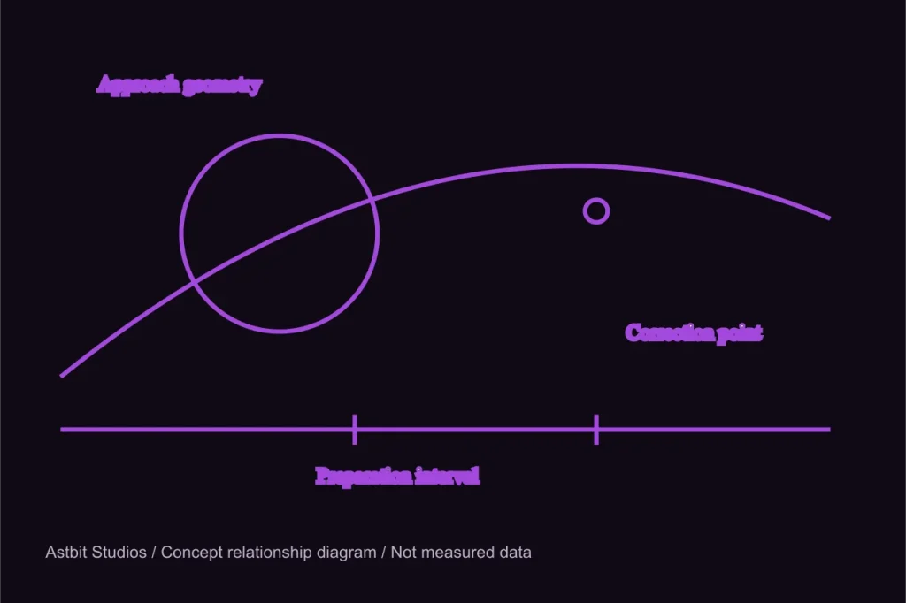
In the proposed Slingshot Ledger interface, the engine burn and the orientation period belong to the same plan. Moving the burn marker changes the preparation interval. A damaged assembly requires more settling time, so a route that was convenient for a healthy ship may no longer be available. The player should see that boundary while comparing alternatives. Waiting until the manoeuvre fails would convert an engineering condition into a surprise rule, which is precisely the kind of difficulty this concept tries to avoid.
Let geometry remain the main picture
The planetary approach still provides the spatial context. A projected path explains where the vessel is going; a separate preparation strip explains what must happen before it can change that path. These views should refer to one another without becoming a single crowded diagram. Selecting a burn in the strip highlights the corresponding point on the route. Selecting the route opens the associated preparation task. The interaction should work with a keyboard as well as a pointer, and text should state the relationship without relying on animation.
Distinguish a warning from a boundary
An approaching limit can be described before it becomes an emergency. The display might indicate that only one preparation sequence remains possible, then explain which action would make that sequence unavailable. It should not turn every shrinking interval red. If all information demands attention at the same intensity, the player loses the ability to prioritise. A boundary deserves a clear label; a developing concern may only need a change in emphasis and a concise explanation beside the affected task.
Avoid an artificial reflex test
The concept is about choosing and preparing, not proving that a person can click a confirmation button quickly. A planning pause or a clear commitment stage would allow the engineer to inspect consequences before execution. Once a plan is committed, the review should show what changed. If later prototypes include real-time events, those events would need to test a meaningful skill rather than exploit the time required to read an unfamiliar interface. Urgency can arise from limited options without making basic comprehension a race.
Show the alternative that remains
When a correction is no longer possible, the display should retain the route and identify what can still be done. Perhaps the ship can accept a less useful departure and plan a later burn. Perhaps another observation can reduce uncertainty before the next decision. The particular alternatives depend on the eventual model, but the presentation principle can be stated now: a lost opportunity should alter the problem, not erase the explanation. The player needs a new question, not a screen that simply declares failure.
The first comparison to build
A compact prototype could present the same approach with two different settling times. The route geometry remains constant while the preparation boundary changes. This isolates the interface question: does the player notice why one case permits a late adjustment and the other does not? Such a study would need an actual implementation and observation before any conclusion could be reported. At present, the accompanying diagram describes the intended comparison and uses no fabricated trial measurements or success rates.
Where the window fits
Read the mission concept for the full sequence from observation to departure review. The earlier reserve note explains why a remaining resource needs a usable opportunity. Together, the two studies suggest a route planner in which every number belongs to an action and every action belongs to a visible condition. That is the intended design direction, not a promise that a finished flight interface already exists.